Trading from the chart
The wide range of financial markets such as stocks, Forex, Commodities, Bonds, Indices, and Cryptocurrencies offer an opportunity to invest anywhere and anytime.

Course name
Start trading
Trading from the Chart
Investors have the option of finding out the performance of a particular financial market and research trends with the help of fundamental and technical analysis before trading. The fundamental analysis is used to determine the intrinsic value of the stock by examining the performance of the company and the prevailing economic conditions of the country.
The technical analysis is the study of price movements and market trends to determine the price of the stock. The price action or finding out the best time to enter or exit the trade is done by using tools such as charts, momentum-based indicators, support and resistance levels, and trend lines.
The Use of Trading Chart
The price action of a particular asset is defined on a ‘Trading Chart,’ also called a daily chart where data points are plotted on a graph. Each data point signifies the price action of the asset for specific trading. Usually, the data points are displayed by bar, line, or candlestick charts. A trading chart can be used to show the price direction of asset for a certain time frame. Traders commonly take help from trading charts that cover multiple time frames and then forecast future price direction.
Trading from the chart is one of the most standard tactics of discretionary traders who make a decision based on the current market information that is available to them. The traders can easily see the price movements and use indicators to identify the levels which are best for price action.
From a technical perspective, a trading chart is a graph that depicts the price movement of stock across a certain time frame. The Y-axis (vertical axis) of the graph represents the price scale, while the X-axis (horizontal axis) demonstrates the time scale. The trend of price movements of the stock are studied from left to right, and the latest price change is the one that is furthest on the right.
The graphical representation makes it easy to assess the value of a particular asset. As a trader you
can easily see if the asset is trading in the extremes (Highs or Lows) or in the middle. Traders
analyze weekly and monthly charts to study the trends and then forecast short, medium or long term
price movements according to their preference. 
Understanding Trading Chart
A trading chart has become an essential tool for technical analysis, and traders may use it to see the price action of an asset for a single day of trading or the price movements of the asset for a specific time period. The candlestick charts are gaining popularity as it conveys the information in a easier way as compared to line charts or bar charts. The candlestick charts depict the opening and closing price and trading range for a particular time interval. But the formation of trends varies on candlestick charts as price movements vary according to the time the trader has selected.
Price is plotted against the range of time and can be from 5 minutes to a year. But the time frames used commonly include hour, day, week, and month. Traders may combine intra-day charts (the price of the asset when the market opens to when the market closes) with long term chart for analyzing the market trade.
But technical analysis is more effective if multiple trading sessions are examined where daily candlestick formations are shown with price movements for a specific time frame. A trader may places two monitors in front of himself where one monitor shows trades done by the hour, and the second monitor shows trades made for the past several days, this can helps the trader to get a complete picture of the price movement of the asset.
The Use of Charts in Trading
The Forex market is termed as the most liquid of all the financial markets, and it can be challenging for investors to achieve consistent gains and minimize losses. The currencies are always traded in pairs, and traders always look to determine the value or conversion of one currency to another, which they can use for either a buy or sell strategy.
There are certain tools that make it more comfortable for traders to know the market conditions and accurately know when to enter and exit a trade. The technical analysis of Forex markets involves the use of Forex charts along with technical indicators.
The Forex charts are a graphical representation that depicts the movement or direction of exchange of currency with time. The graph shows the exchange rate of a currency pair such as GBP/USD over time. The Forex charts are set by daily time frames, but the traders can select the time frames that suit them. For example, if you select a 60-minute timeframe, then the line, bar, or candlestick will show 60 minutes of trading data.
The data points on the Forex charts are also displayed in the form of bar, line, and candlestick like in the stock market. The candlestick charts are favorite among the traders as it shows all the relevant information in a sequence that includes the open, close, high, and low price of the currency pair for a given time frame.
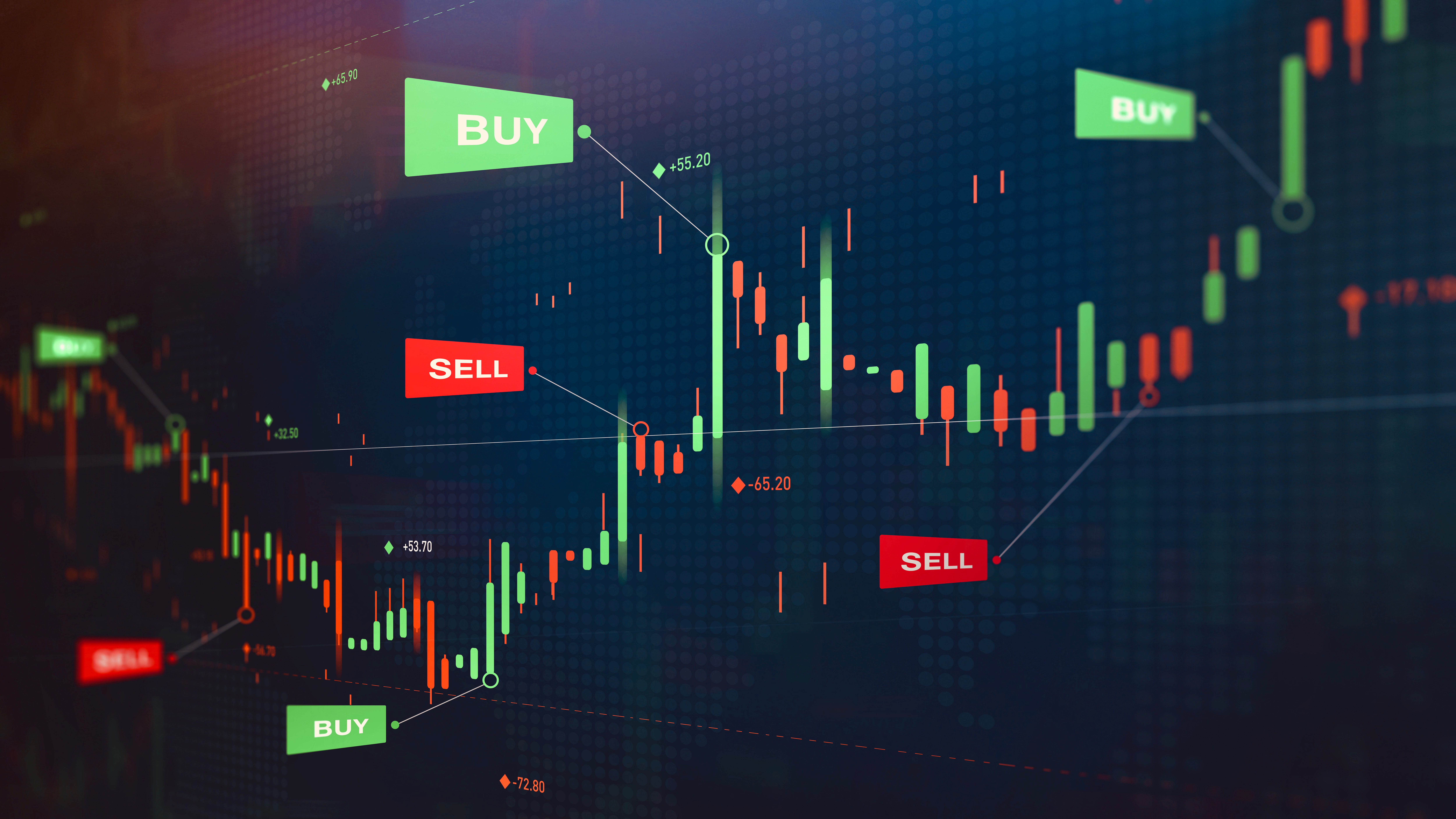
The candlesticks are colored ‘red’ and ‘green’ that shows the difference between the opening and closing price of the currency for a particular time period. If the opening price is higher than the closing price, then it is a red candlestick, and if the opening price is lower than the closing price, then it is a green candlestick. The black lines present above and below the candlesticks are called ‘wicks’ and show the highs and lows of currency price during a given time frame.
How to Read Charts
All the trading charts use Y-axis for price of the asset and X-axis for time. Similarly, in Forex charts, the Y-axis represents the ‘exchange rate,’ and the X-axis shows ‘time.’ The few situations that can help traders make a decision are
- If the exchange rate has risen from the left side of the chart to the right, for that time frame the market is set to have an upward trend and buyers are controlling the market
- If the exchange rate has fallen from the left side of the chart to the right, for that time frame the market is set to have a downward trend and sellers are controlling the market
Online asset Charts
The asset charts online help the traders to evaluate the market and forecast the future price movements of the asset by a multitude of tools and indicators. It is quite clear to determine the trend of the market from the graph.
The trend moves a series of highs and lows; a Bullish trend means an upward trend and can be identified as a peak on the graph. The Bearish trend means a downward trend and identified as a valley on the graph. There is also a horizontal trend when the supply and demand forces are equal. The three charts that are most commonly used by traders are line, bar, and candlesticks.
- Line chart
The line chart is the most basic chart for technical analysis. A line is drawn from one closing price to the next closing price. The price movement of currency pair for a time frame can be identified when the lines are connected. The line chart is mostly used for studying big picture trends.
- Bar chart
The bar chart offers more information than a line chart. A bar chart shows both the opening and closing prices as well as both the highs and lows. The vertical bar represents the trading range of the currency pair. The bottom of the bar depicts the lowest traded price for a particular time period, while the top shows the highest traded price. The right horizontal hash is the closing price, whereas the left side of the bar is the opening price.
- Candlestick chart
The candlestick chart is provide more information for traders as it shows a variety of price action patterns. The candlestick chart is similar to a bar chart as it also indicates the opening, closing, high, and low values for a given time frame. But the candlestick chart has ‘boxes’ between opening and closing values called ‘body.’ The color of the body shows whether the market has an upward or downward trend for a given time period. The white color denotes a Bullish trend while a black color shows a Bearish trend.
The information above is for education purposes only and cannot be considered as investment advice. Past performance is not reliable indicator of future results.


